SAVINGS BANK OF WALPOLE
Community Bank Website Reenvisioned
The Savings Bank of Walpole, a 150-year-old community bank, needed a full website overhaul to reflect its evolving brand and to better serve both personal and business banking customers.
Challenge
The Savings Bank of Walpole site was difficult to navigate, outdated, and no longer aligned with user expectations or behavior. It was overloaded with text and content that made it difficult for users to find the information they needed. Additionally, the old site had a lot of technical debt including features that were no longer needed and legacy code, so a fresh start was in order.
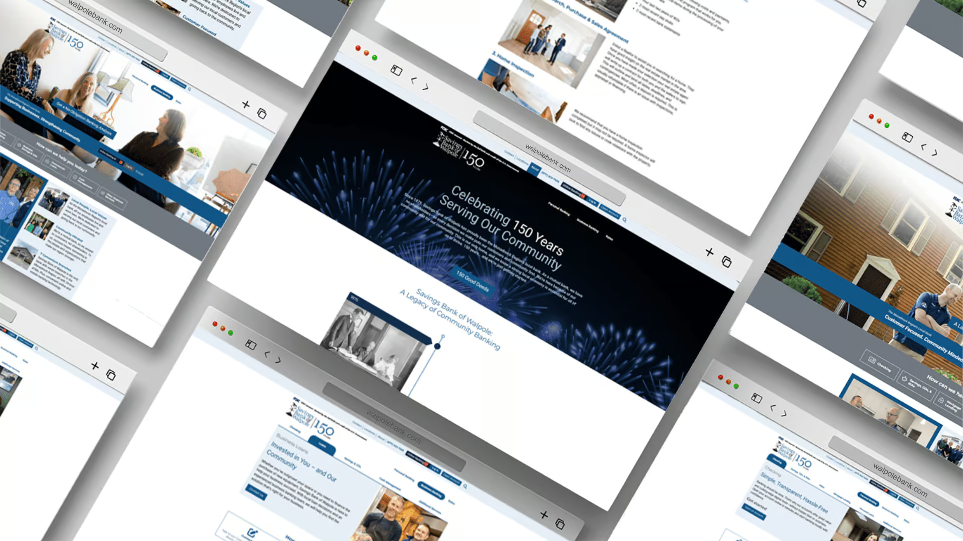
With their 150th anniversary approaching, a milestone year full of community pride, Savings Bank of Walpole recognized the perfect opportunity to pair this celebration with a much-needed overhaul of their online presence. Their new site would not only modernize the customer experience but also showcase the bank’s deep roots in the community in a meaningful way.
Strategy
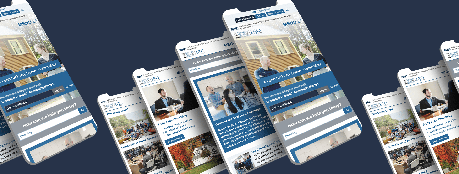
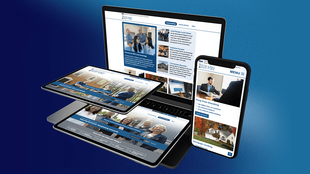
At the heart of the redesign was bold reimagining of the site’s information architecture. Moving away from traditional top-down menus, content was reorganized into two clear silos: Personal and Business Banking. Each silo acts as a hub tailored to user goals, featuring regional photography, community-focused messaging, and icon-driven navigation that brings the local brand to life. Streamlined pathways, modular layouts, and custom iconography reduce friction and make the site easier to use. Clear, action-oriented CTAs like ‘Open an Account’ or ‘Get a No-Obligation Banking Analysis’ guide users to complete key tasks.
Every design decision was aimed at making users feel informed, confident, and supported throughout their journey, whether they’re checking interest rates, exploring business financing options, or learning about Savings Bank of Walpole’s community involvement.
Key elements of the strategy included:
- User-centered design: Insights from analytics, usability testing, and heatmap analysis guided decisions to remove unnecessary complexity, reduce visual clutter, and prioritize user goals.
- Content clarity: Service pages were restructured with concise, scannable information and strong CTAs to guide and encourage next steps.
- Brand integration: Local imagery, updated iconography, and refreshed color palette reflected their 150-year legacy and deep community ties.
- Technical foundation: Built on a custom WordPress platform optimized for accessibility, SEO, and content management. Custom features included a re-engineered rates plugin with an approval workflow for the internal team, an exit notifier for external links, and an interactive 150-year timeline enhanced by a JavaScript fireworks display.
- Scalability: The website was designed to adapt to evolving customer needs, enabling them to easily add features, services, and content over time.
Results
The redesigned website has demonstrated clear improvements in user behavior and efficiency. Key conversions increased by 55%, while user engagement rose by 5% and page views by 4%, indicating that visitors are not only staying longer but exploring the website more deeply. Support inquiries have dropped by 29%, showing that visitors are now able to find information and complete tasks without requiring assistance. The most compelling impact is that 67% more users are starting to open accounts online, confirming that the new design, content strategy, and UX delivered on users’ core needs.
55%
Increase in Key Conversions
29%
Drop in Support inquiries
67%
Increase In Online Account Applications

Every decision was to make users feel informed, confident, and supported throughout their journey. The redesigned website has demonstrated clear improvements in user behavior and efficiency, confirming our strategy delivered on users’ core needs.
AWARD-WINNING WORK


More Case Studies


Stay connected with updates on our work, what we’re learning, and life behind the scenes at Paragon.