How to Make Sure Your Website is Responsive and Mobile-Friendly
Have you checked into where your website traffic is coming from lately?
Specifically, what visitors are using to find and navigate to your website? You’ll most likely find that many visitors are using mobile phones to view and interact with your site, which means you need to make sure your site is performing well for them on these devices.
These days, having a mobile-friendly website isn’t nice to have, it’s a must-have. Curious about how to deliver a great mobile experience for your website visitors? Here’s an overview about responsive design, why it matters, how to test your website, best practices, and more.
What is responsive design?
We’ve used a couple of different terms already, including: “responsive design” and “mobile-friendly,” so let’s look at what they are. First, responsive design is a web design technique that means your website is responsive to the screens or window sizes on a variety of devices.
To give an example, consider a website like Amazon – have you seen how it appears on a desktop or laptop screen, compared to the screen of your mobile phone? The website works for users on both but has a different appearance. On desktop, you’ll see products in rows horizontally across your screen, so if you’re searching for something, you see more results in one view. On mobile, those search results are displayed in a single column so users can see larger images and easily scroll down. This is a user-friendly approach because it avoids users having to try to scroll across or pinch their screens to make them smaller and show anything out of view.

In addition, responsive design adapts how a single-page version renders on a screen. You may also hear the term adaptive design. This is similar, except it delivers multiple different versions of the same page, depending on the type of device being used.
As for mobile-friendly, this simply means that your regular website shrinks down to suit a mobile screen. Sometimes this isn’t enough to be truly friendly to mobile users though. You want to make sure that the overall experience of mobile users is intuitive, functional, and as simple as possible.
Why does mobile-friendliness matter?
Quite simply, in this day and age, it’s no longer good enough to design your website for a single type of device. Visitors who are frustrated when viewing sites on their iPad, phone or desktop could abandon a website if they can’t get the information they’re looking for or perform the actions they need to complete easily.
Having a mobile-friendly website matters because mobile is increasingly the predominant web browsing choice. In the US, 51% of all time spent online is completed on mobile phones. Additionally, mobile market share has consistently risen each year. Businesses that don’t cater to the mobile market will find themselves at a disadvantage.
Another important reason to make sure your website is mobile-friendly is so your site is being seen and ranked by Google. Mobile-friendliness of websites has been a search engine ranking factor for a couple of years now and is an essential component for your SEO.
Google looks at your mobile page load speed as a key metric toward search rankings. They want to point mobile traffic to the best results, so it’s important your site loads quickly and delivers a good mobile experience.
Pitfalls of websites on mobile
Remember how we said the definition of mobile-friendly (shrinking a website down to fit on mobile) doesn’t always mean that it’s user-friendly? There are pitfalls you’ll want to avoid when designing for mobile friendliness because often, a smaller version of a website simply doesn’t cut it.
For example, sometimes you’ll find that a website may be friendly for one platform, but not for another. Maybe it works fine on an iPad but is almost impossible to use on an iPhone. It’s important to test your website across different platforms and we share more information about testing in the next section.
Other issues include how the mobile user can navigate the website and whether there are usability issues. For example, sometimes website navigation doesn’t translate well to mobile and the user is left pinching or expanding the screen, trying to find and click to move to a different page. Building a specific mobile menu can help this issue. Sometimes, popups and chat boxes overlap menus and content, items don’t scale or stack properly, or content is structured in such a way that it doesn’t make sense on mobile.
If you’re website doesn’t translate well on mobile devices, it’s important to resolve this not only for your visitor experience but also for search engine optimization.
These days, having a mobile-friendly website isn't nice to have, it's a must-have. Share on XTesting your website
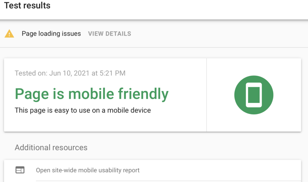
How will you know if you have issues to fix on mobile? You need to test your website. There are a variety of tools available and one to start with is Google’s mobile-friendly test. This tool is very simple – all you do is input your URL into the search box and it provides you a quick analysis as to whether or not your website is mobile-friendly, including a screenshot of how it looks on mobile and any recommendations or alerts.

It’s a basic tool, however, it provides a great place to start in reviewing the mobile friendliness of your site. For example, in the above screenshot, you can see an alert for “page loading details.” When you click on “view details” it provides a list of any pages that didn’t load or were very slow to load.
You’ll also want to check how your website appears across different devices, and for that, Screenfly is great. Similar to the Google tool, all you do is input the URL of the page you want to test. You can select different options from their top menu to see representations of how your site appears on each device. For example, they have different browser screen sizes, and device types. Below, is an example of how our website renders on a Google Pixel:

Best practices for mobile-friendly websites
Let’s say you’ve tested your website and found a few issues with mobile-friendliness that need your attention – what’s next? Here’s a few of our recommended best practices:
- Make sure your website has a responsive design. This goes beyond mobile-friendliness and optimizes the appearance of your content for mobile devices. To go a step further, you may want to explore adaptive design, which loads a different version of your site depending upon the device.
- There are many web builder tools, templates and themes that are built to render and function responsively which helps to simplify the web design process. Additionally, working with an experienced web designer or agency can be helpful if you need a customized, responsive website based on your goals and needs.
- Prioritize the information on your website. Remember that a mobile user doesn’t see a wide view like a desktop user, so keeping the most important information at the top of the page should be a priority. It also helps to look at your key content and rank it in order of importance. Your key information should be the easiest to find.
- Prioritize mobile load speed. This is important for the visitor experience, which also makes it good for SEO. Very few visitors will wait longer than 5 seconds for a page to load, and if they’re clicking away, it’s sending poor signals to Google.
- Ditch any unnecessary elements on mobile. For example, popups can sometimes be difficult to close on mobile, and ads can take up important real estate on small screens.
- Remember that less is more when it comes to web design. The most effective designs tend to also be the simplest, where the user can easily understand how to navigate and what actions to take. It should be an intuitive experience.
- Break up text and use larger font sizes. Remember that larger blocks of text will fill up the screen and may be hard to read. If you break up text into smaller chunks, it can provide an easier reading experience.
- Triple-check any buttons! Awkward buttons that are difficult to use can be an issue on mobile sites. Make sure buttons sizes are appropriate, it’s very frustrating trying to click an “X” to close a window that’s way too small or hitting the wrong button because it’s too small or too close to another button.
Final thoughts
Having a mobile-friendly website is essential, both for rising number of users viewing sites on mobile devises and for search engine optimization. A responsive design will ensure that your website renders well on different devices, allows your visitors to find information and take action on your site, provides a great user experience, and helps you rank well in search results.
If you need help with mobile-friendly or responsive design testing and/or optimization or are looking to redesign your site, our experienced team can help. Contact us today.
Read More:
How to Craft an Engaging Mobile Experience
Are You Thinking Mobile For Social?
What Does Website Accessibility Mean?


